Ollie's
Building the food and packaging content world for a burger brand.
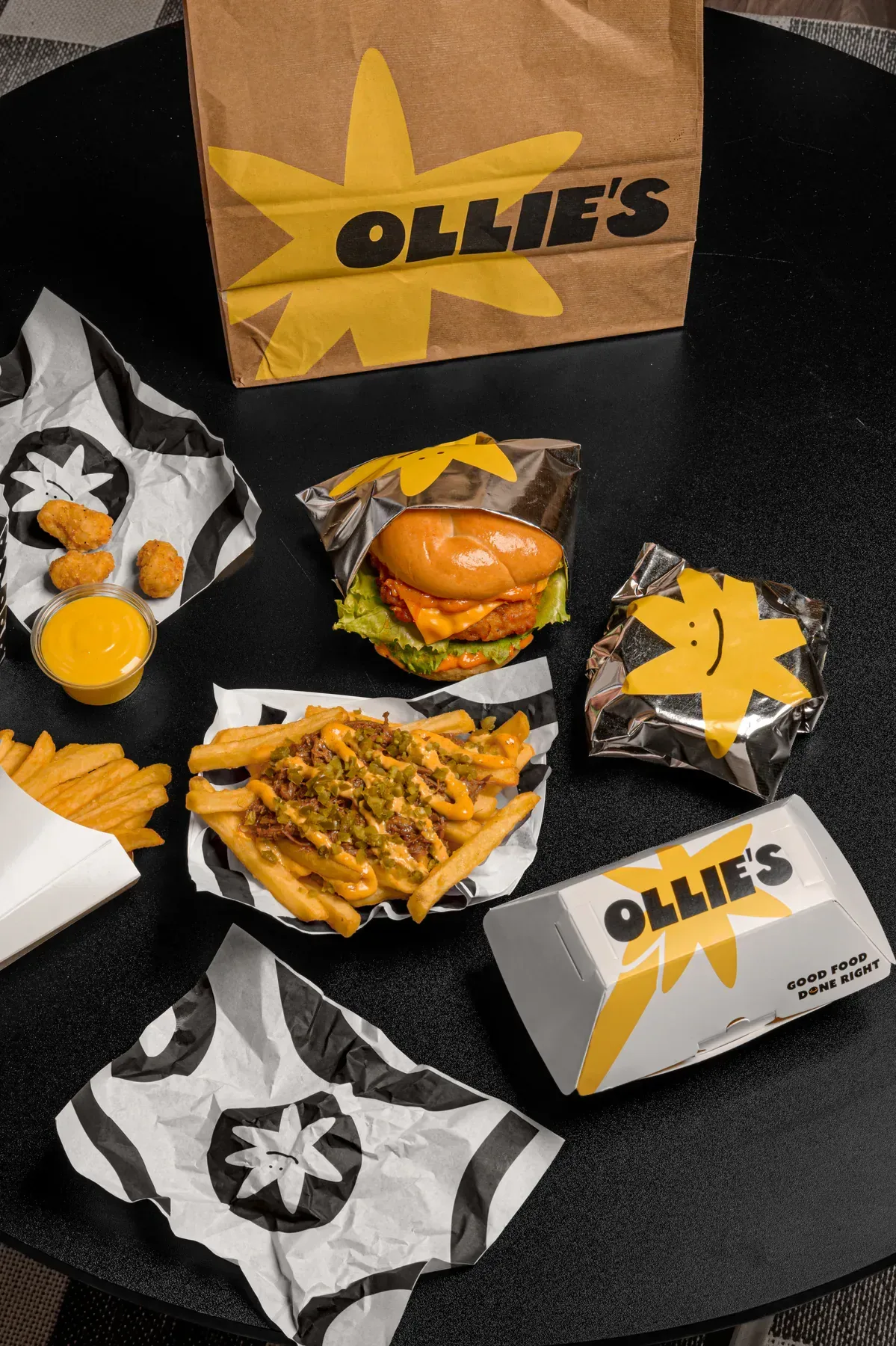
Ollie's combines a playful graphic identity with indulgent food photo and video. Bricks built a content world where packaging, colour, product, and personality work together in every frame.
A recognisable set with enough range for launches, product stories and always on posting.
- Brand world
- Art direction
- Photo & video
- Content
The brief
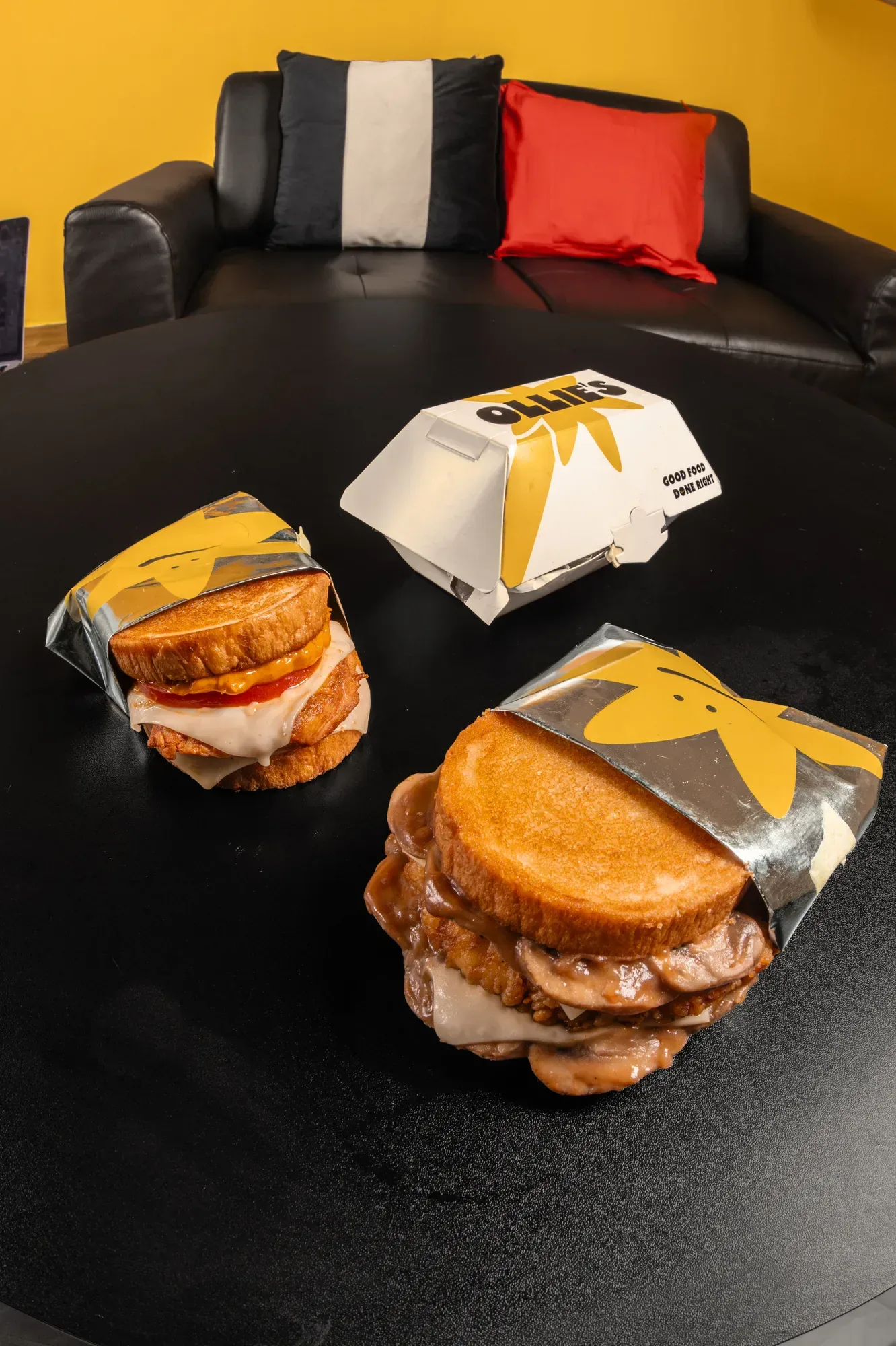
Ollie's has a loud graphic identity, a yellow star and a lot of red. Food shot the usual way disappears next to it. We were asked for pictures that sit inside the brand without the food and the identity shouting each other down.
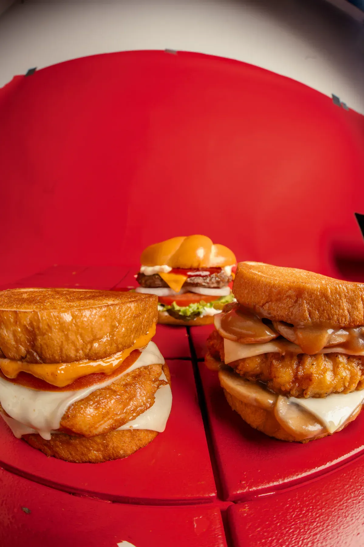
Colour first
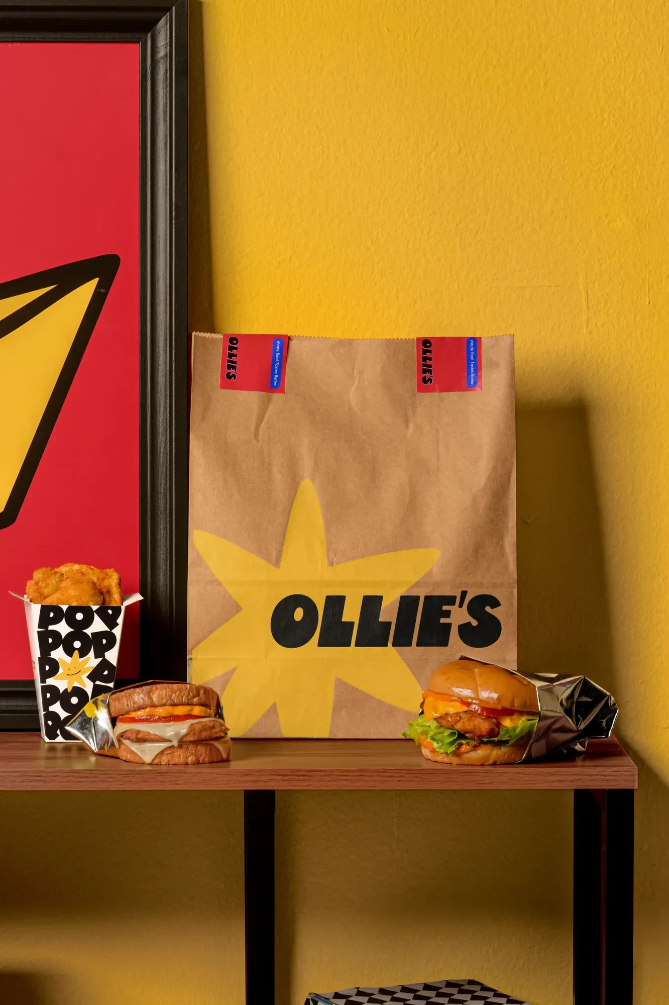
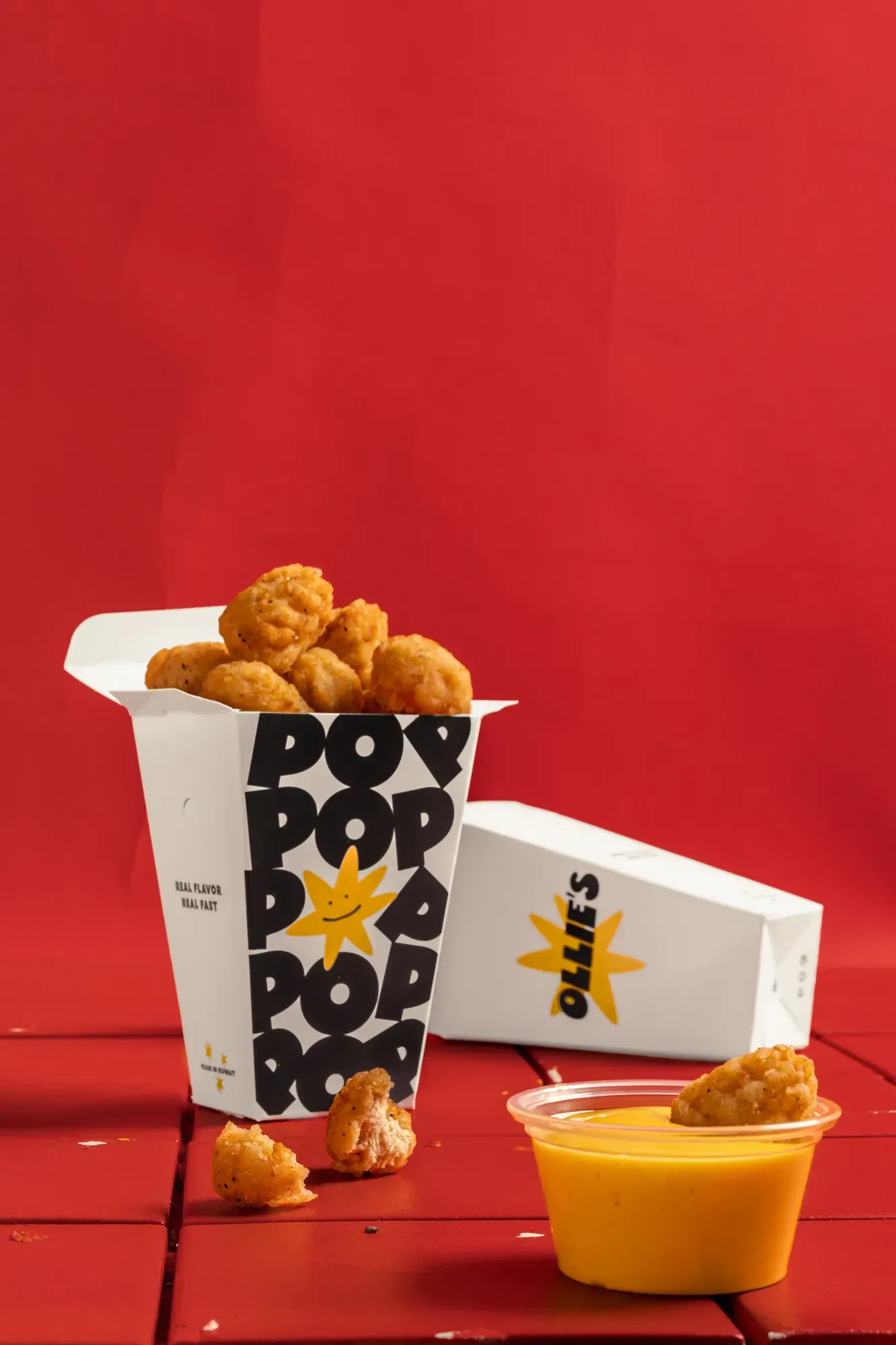
We treated packaging and backdrop as part of the styling rather than props next to it. Blocks of yellow, red and black are set before the food arrives, so a single frame reads as Ollie's at thumb speed. It also means a new item drops into a set that already works.
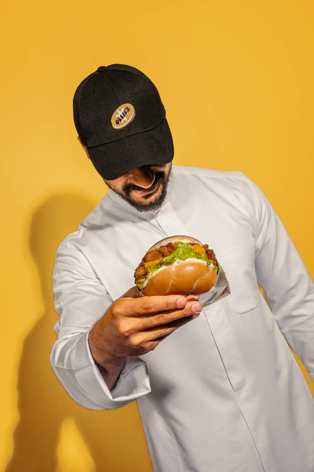
People in the frame
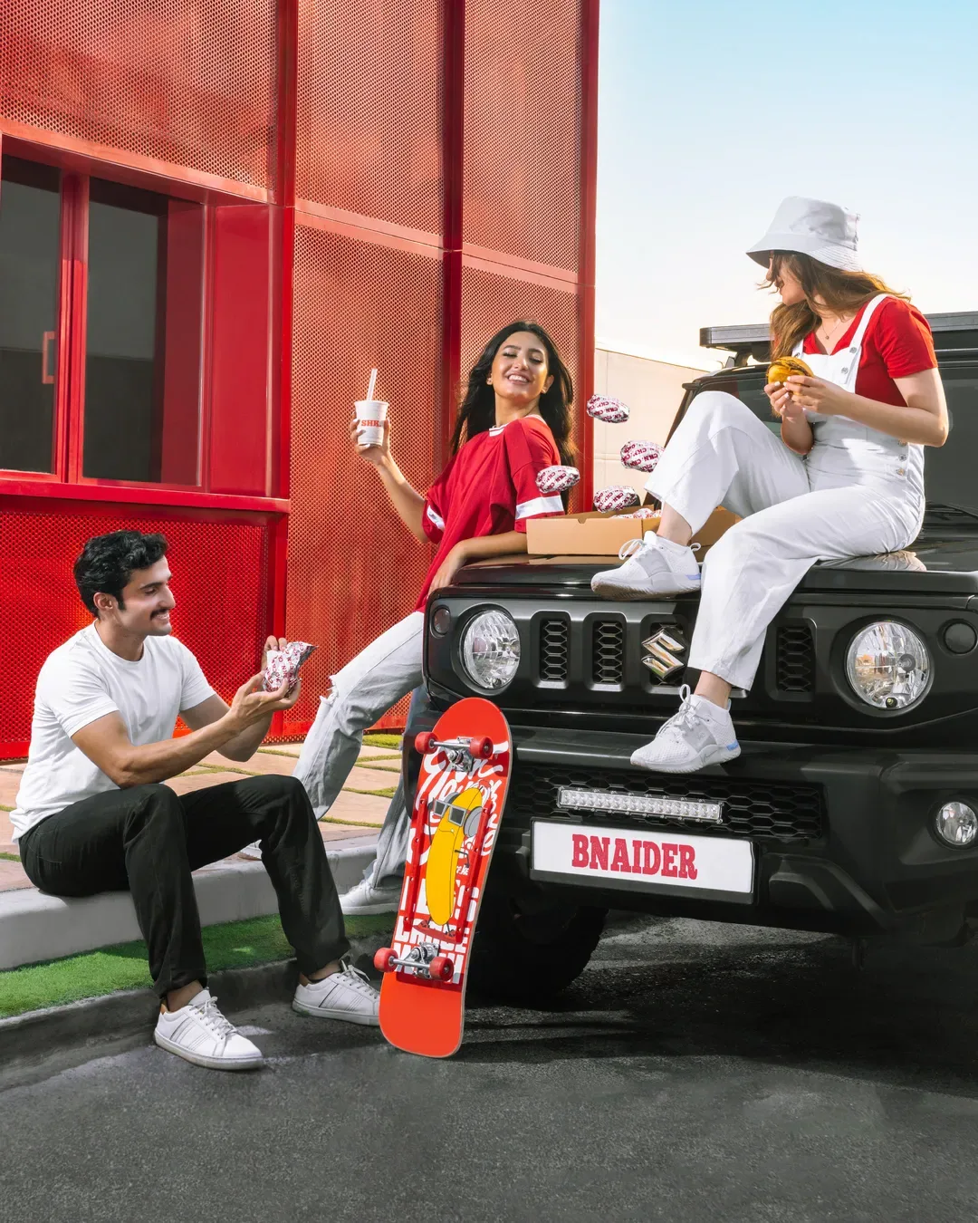
Not every post should be a still life. We shot a small run of people frames where the food is the face of the picture, which gives the feed a change of pace and something to use in stories. The wall stays flat so the crop can move.
The menu, item by item
The rest of the shoot worked through the menu in matched light. Every item was covered open and closed, so one picture can serve a launch post, a delivery listing and an in store screen. That consistency is what makes a grid look built rather than collected.
Where it went
The set now runs across social, delivery apps and in store menus. New items drop into the same frames without booking a new shoot, which is usually the difference between a brand that looks consistent and one that does not.
Next case study
All work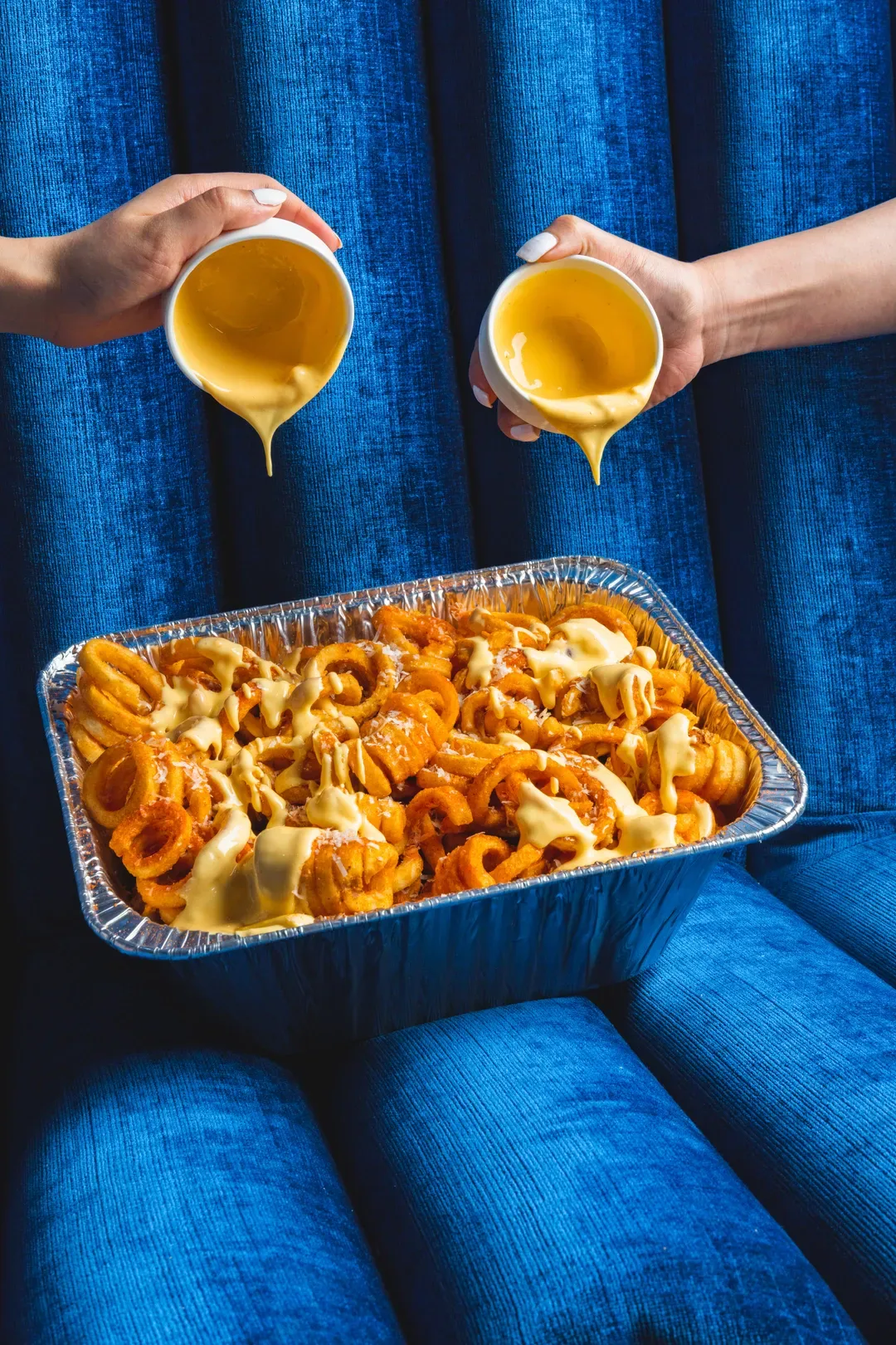
Work with us
Start a project.
Tell us about the brief and who it is for.