CRUST
A content and offer system for a pizza and sandwich brand.
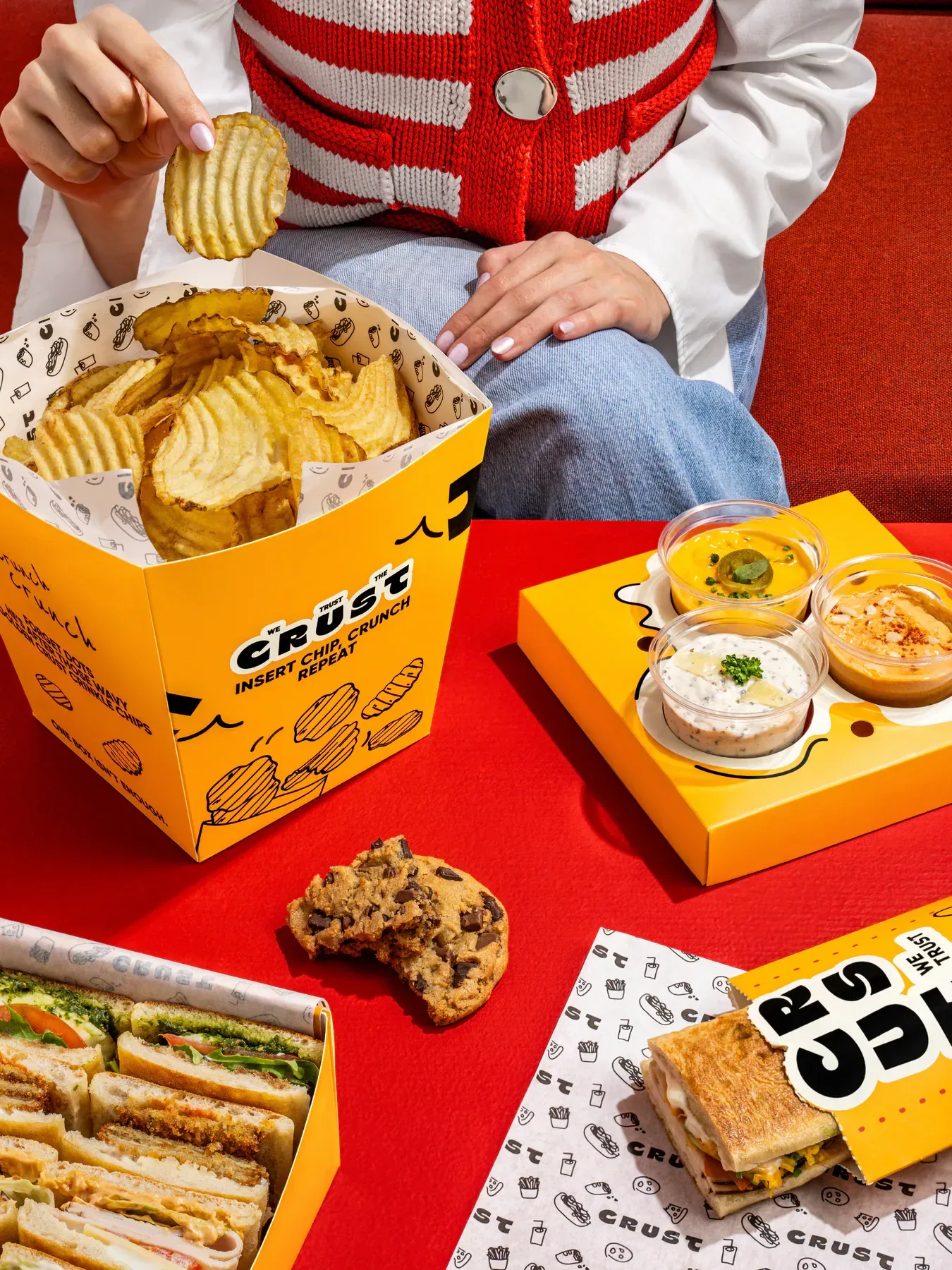
CRUST's visual world uses direct colour, graphic packaging, and energetic food styling. Bricks developed a varied content set that makes product offers feel like part of the brand, not an interruption to it.
One library that carries tactical promotions and brand posts without the two looking unrelated.
- Campaign
- Content system
- Food styling
- Photo & video
The brief
CRUST runs offers constantly, and offers are usually where a brand look goes to die. We were asked for a system where a price sitting on an image still feels like the brand. That meant designing the pictures and the promotions at the same time, not one after the other.
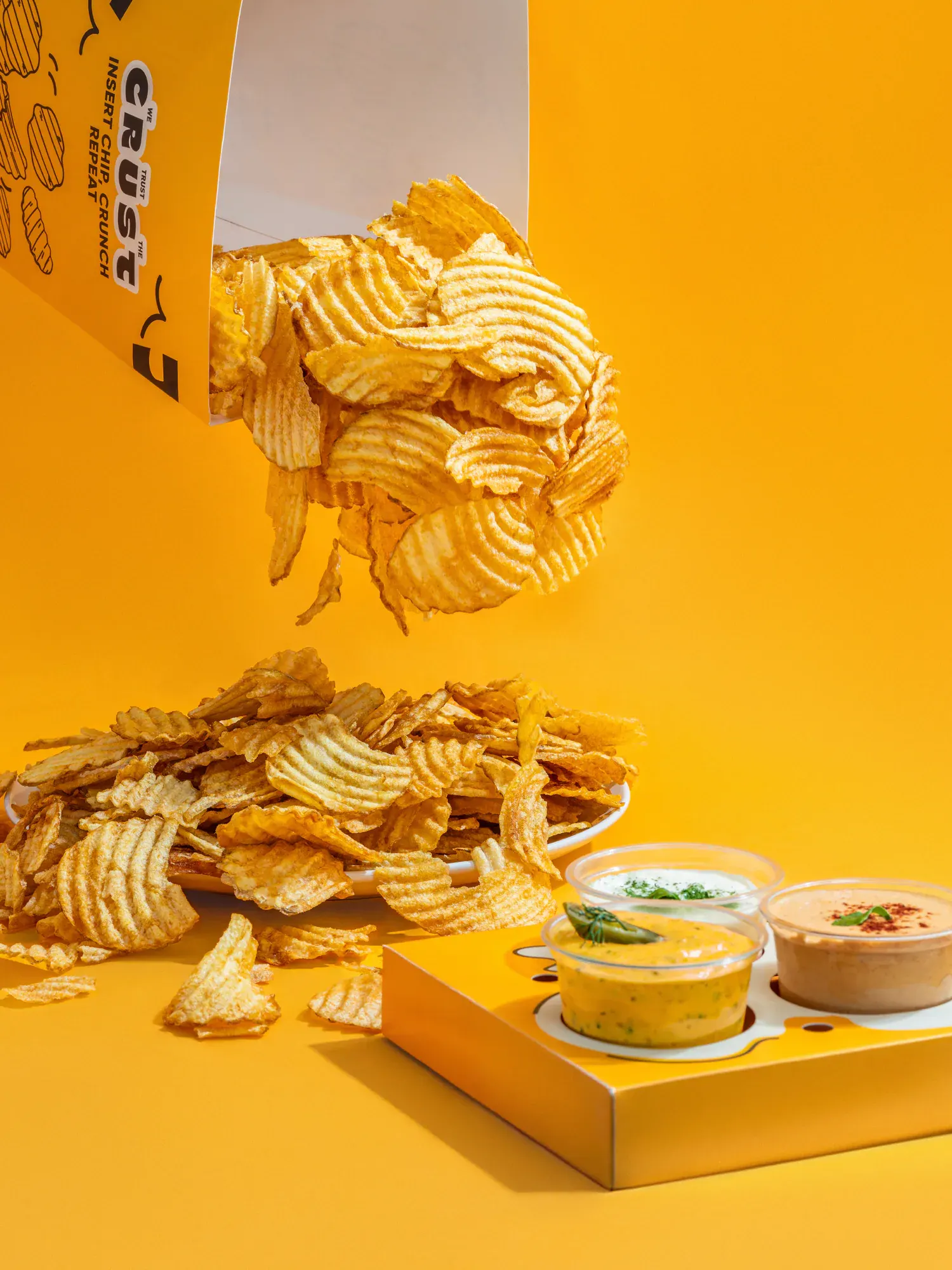
Colour is the constant
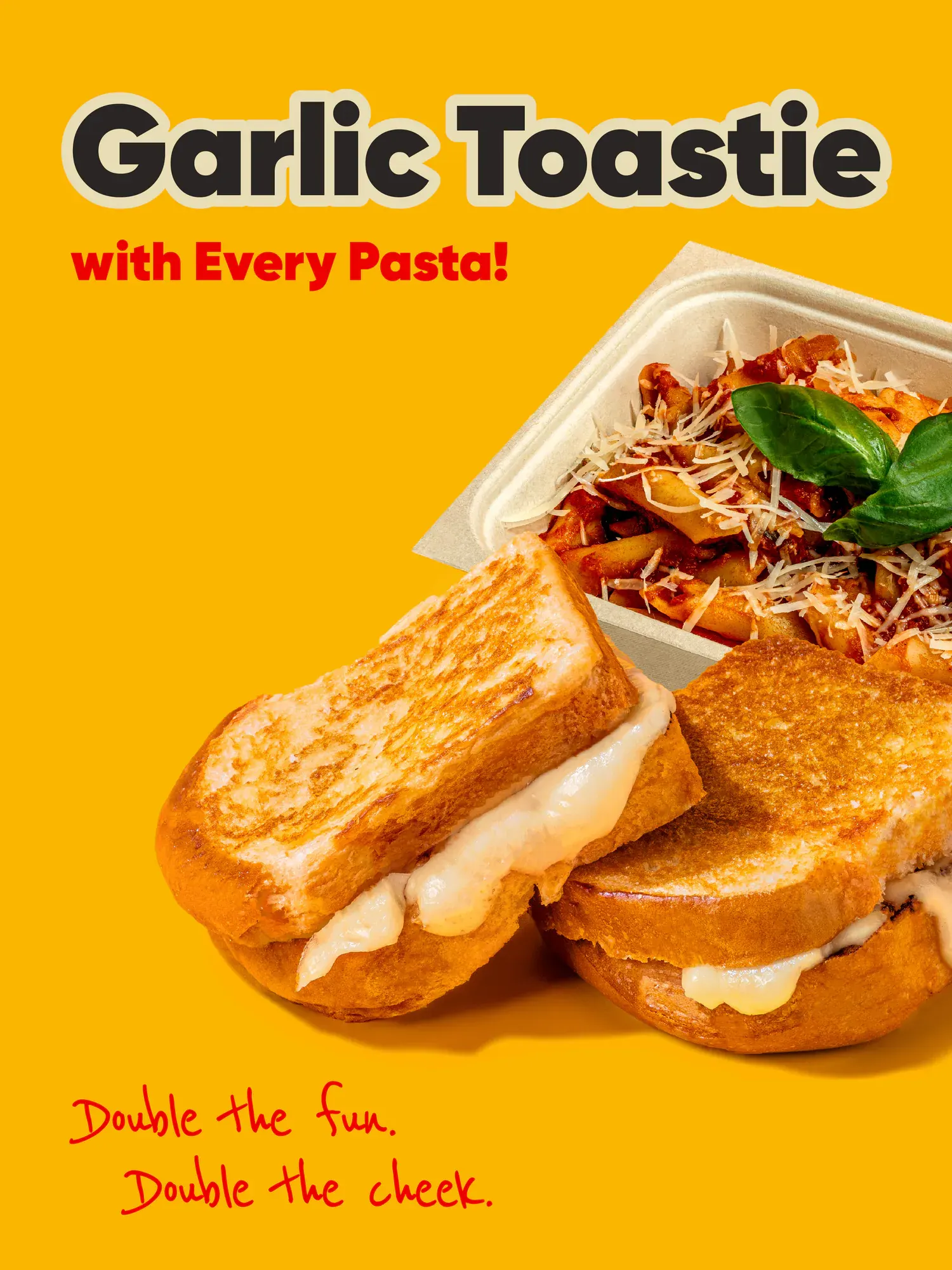
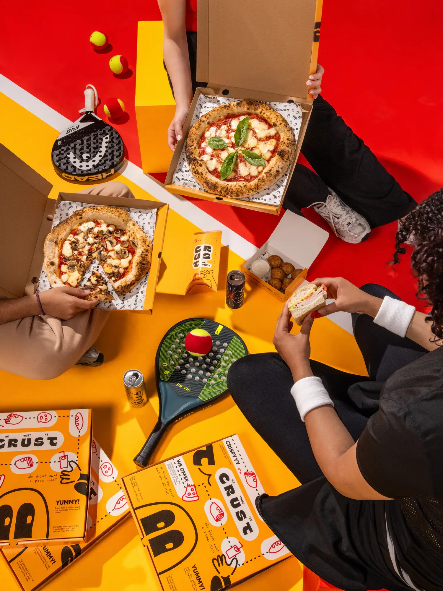
Yellow and red do the recognising. Product is shot on those two grounds with space left where a headline and a price will land, so nothing has to be squeezed in later. A tactical post and a brand post end up looking like they came from the same place.
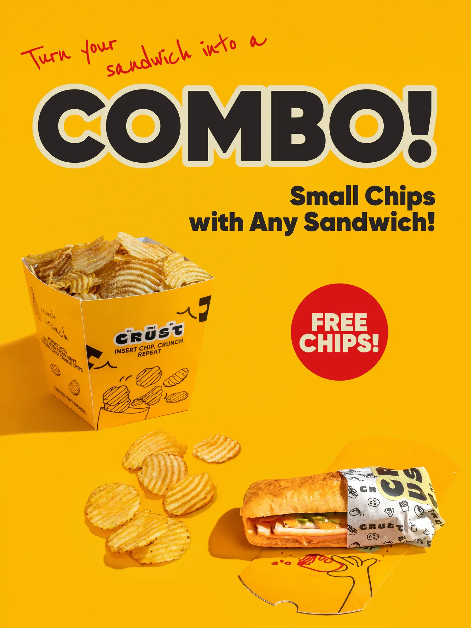
Offers that look like the brand
Each promotion gets one clear idea and one number. Props carry the season, so an offer reads as an occasion rather than a discount. Because the sets are built to a template, a new price point is a new layout instead of a new shoot.
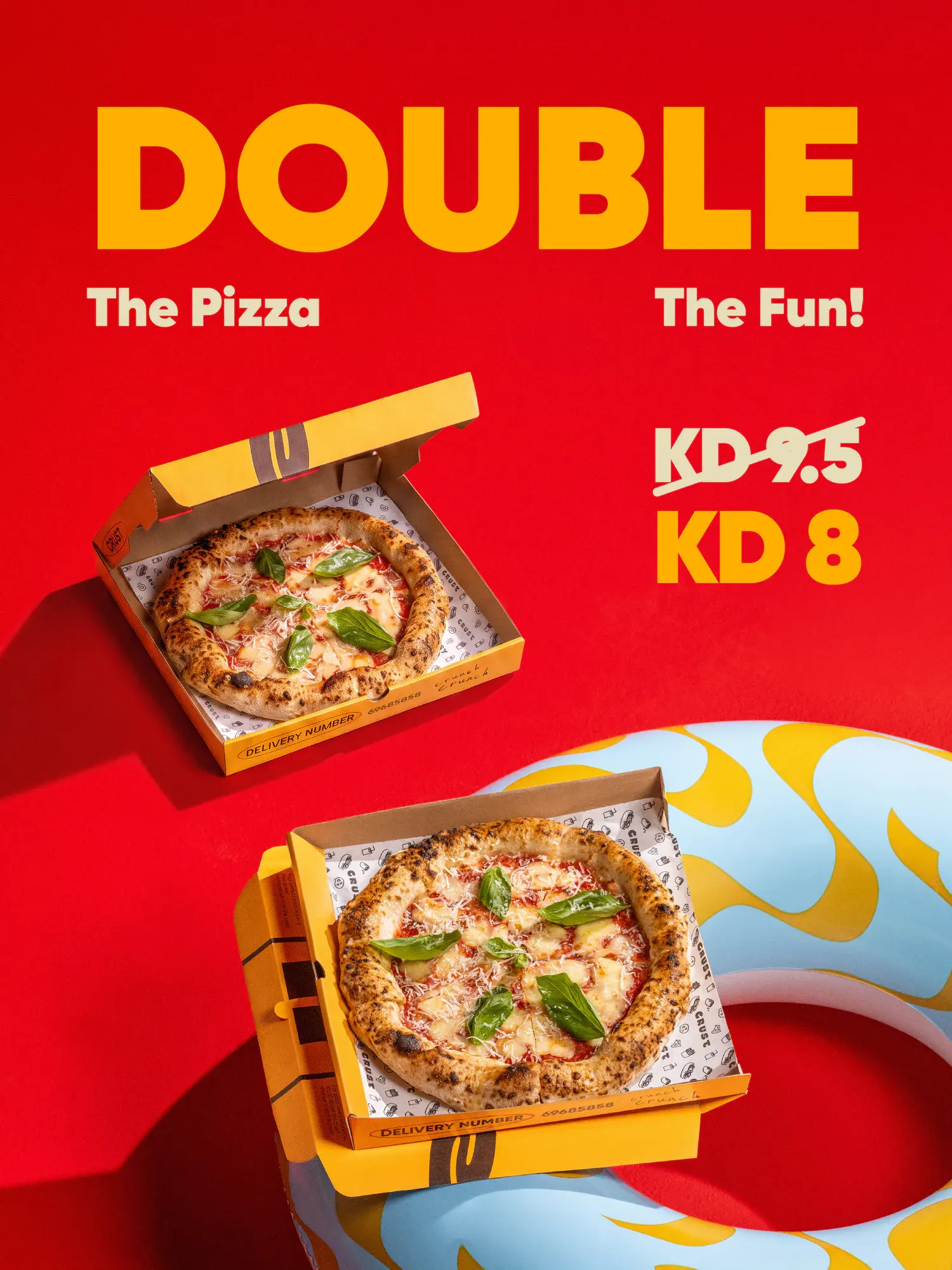
Room for the menu to change
The same frames absorb new items easily. Pasta, toasties, sandwiches and sides were all covered in matched light, so the menu can change without the feed changing with it. Handwritten type keeps the tone light where the offer is loud.
Where it went
Lifestyle frames give the grid somewhere to breathe between the offers. One production now carries promotions, delivery listings and always on posting. The colour is still the fastest way to recognise CRUST in a busy feed.
Next case study
All work
Work with us
Start a project.
Tell us about the brief and who it is for.