Al Nawasi
A bilingual identity and guidelines for Al Nawasi.
Brand identity
About the project
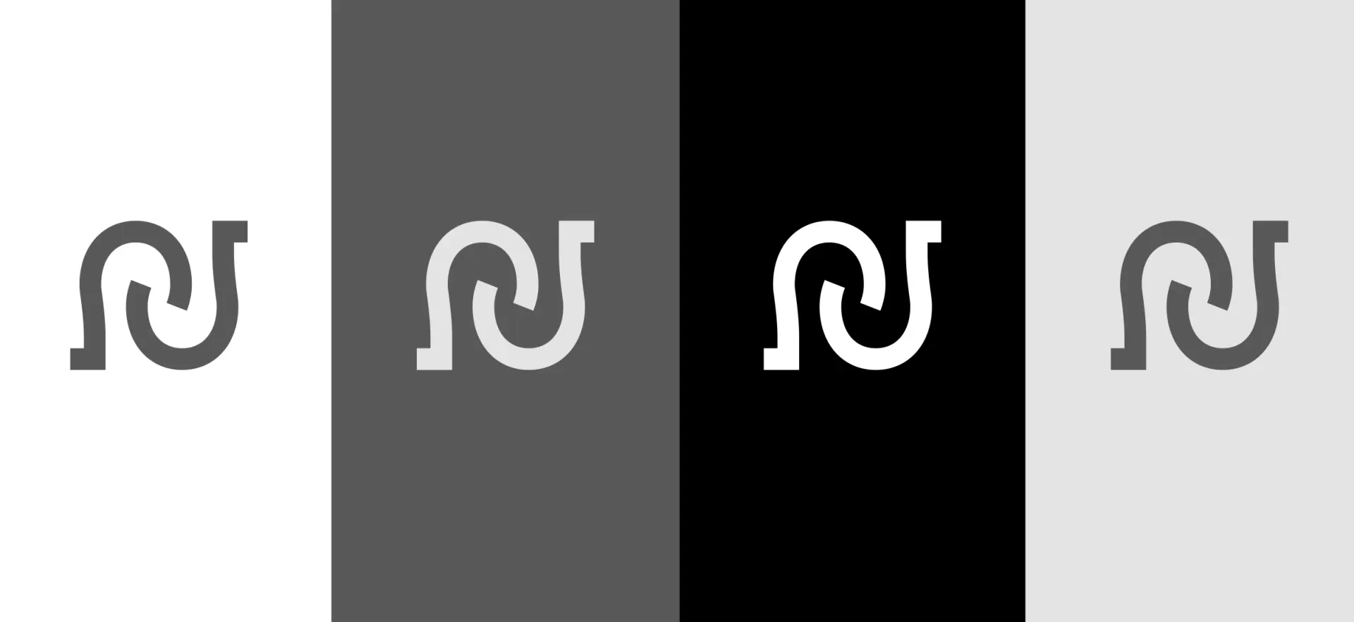
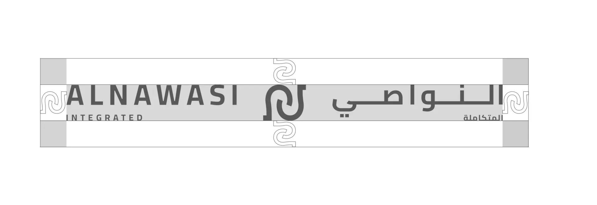
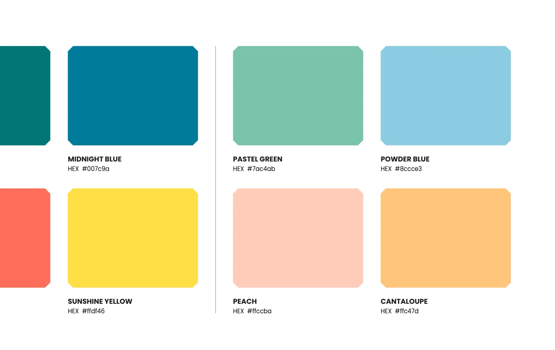
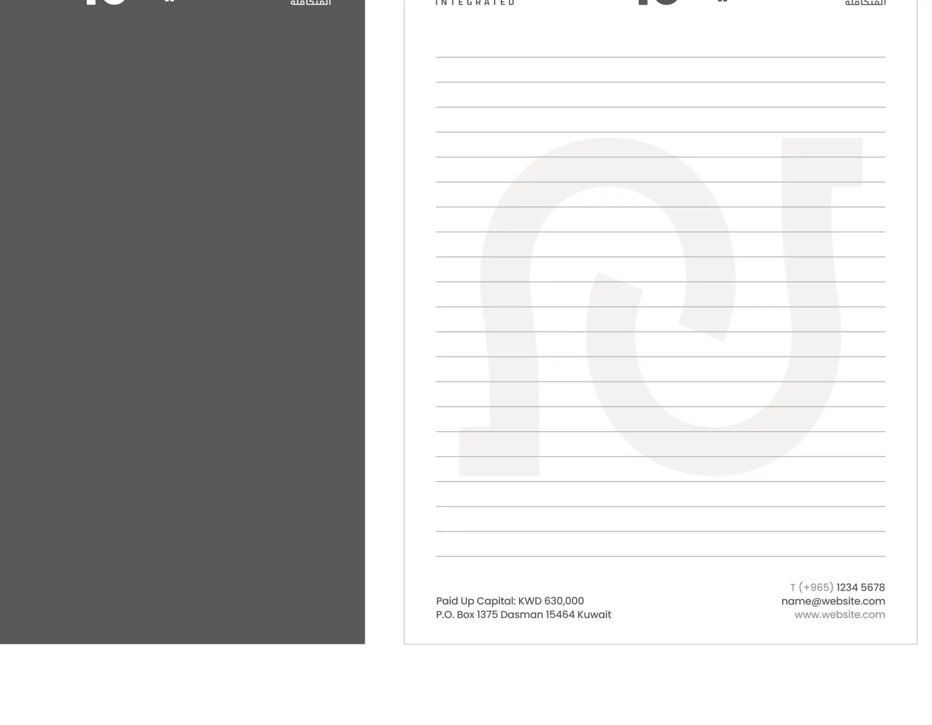
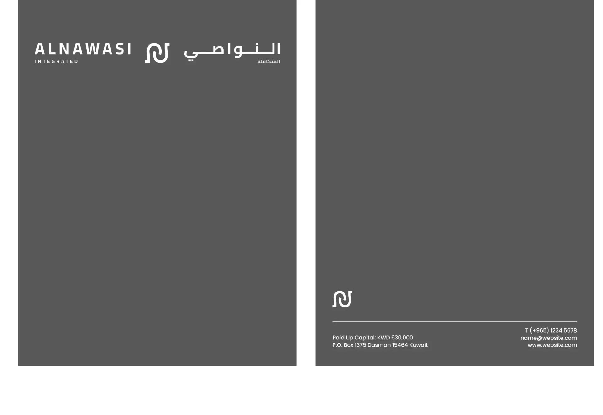
Bricks developed a horseshoe-inspired monogram and Arabic and English wordmarks for Al Nawasi. The guidelines define the corporate palette, a broader product colour system, typography and stationery.
The monogram combines the horseshoe reference with the letters of the name. Corporate documents use a restrained grey palette, with a separate colour system for brand communications.
- Client
- Al Nawasi
- Sector
- Food distribution
- Year
- 2024
- Scope
- Visual identity, Brand guidelines

More branding work
All branding
Work with us
Build your next chapter.
Tell us about the brand and where it needs to go.