Anemone
A floral identity for a footwear brand.
Brand identity
About the project
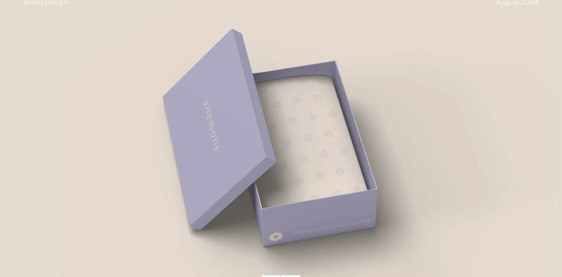
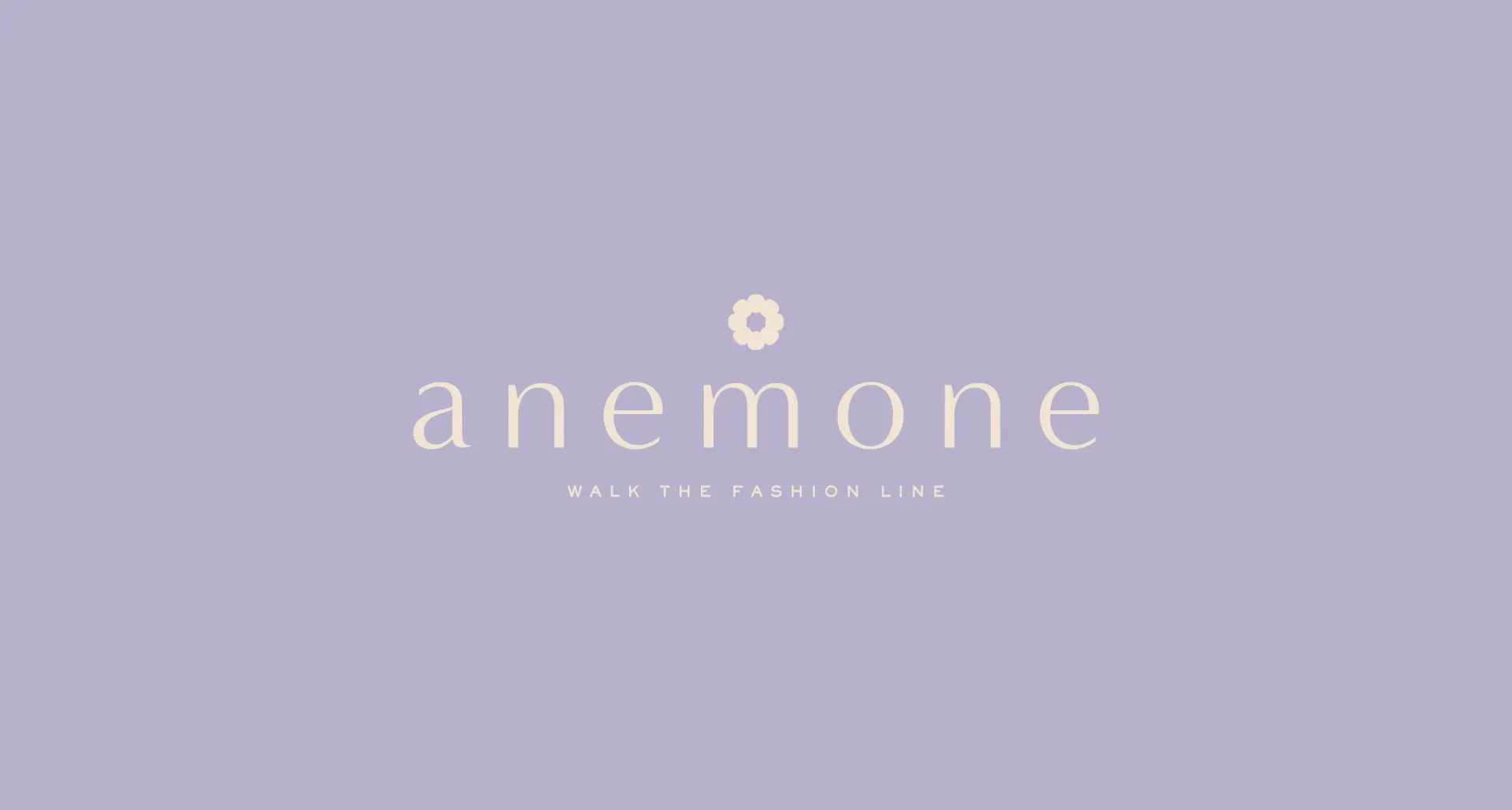
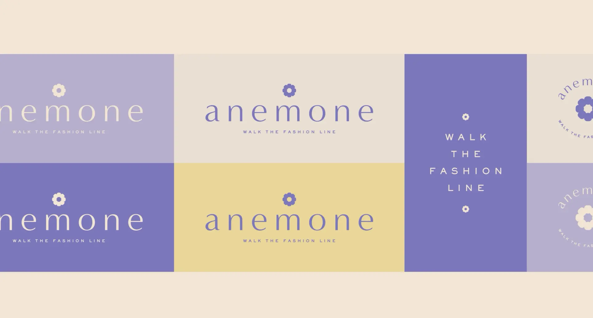
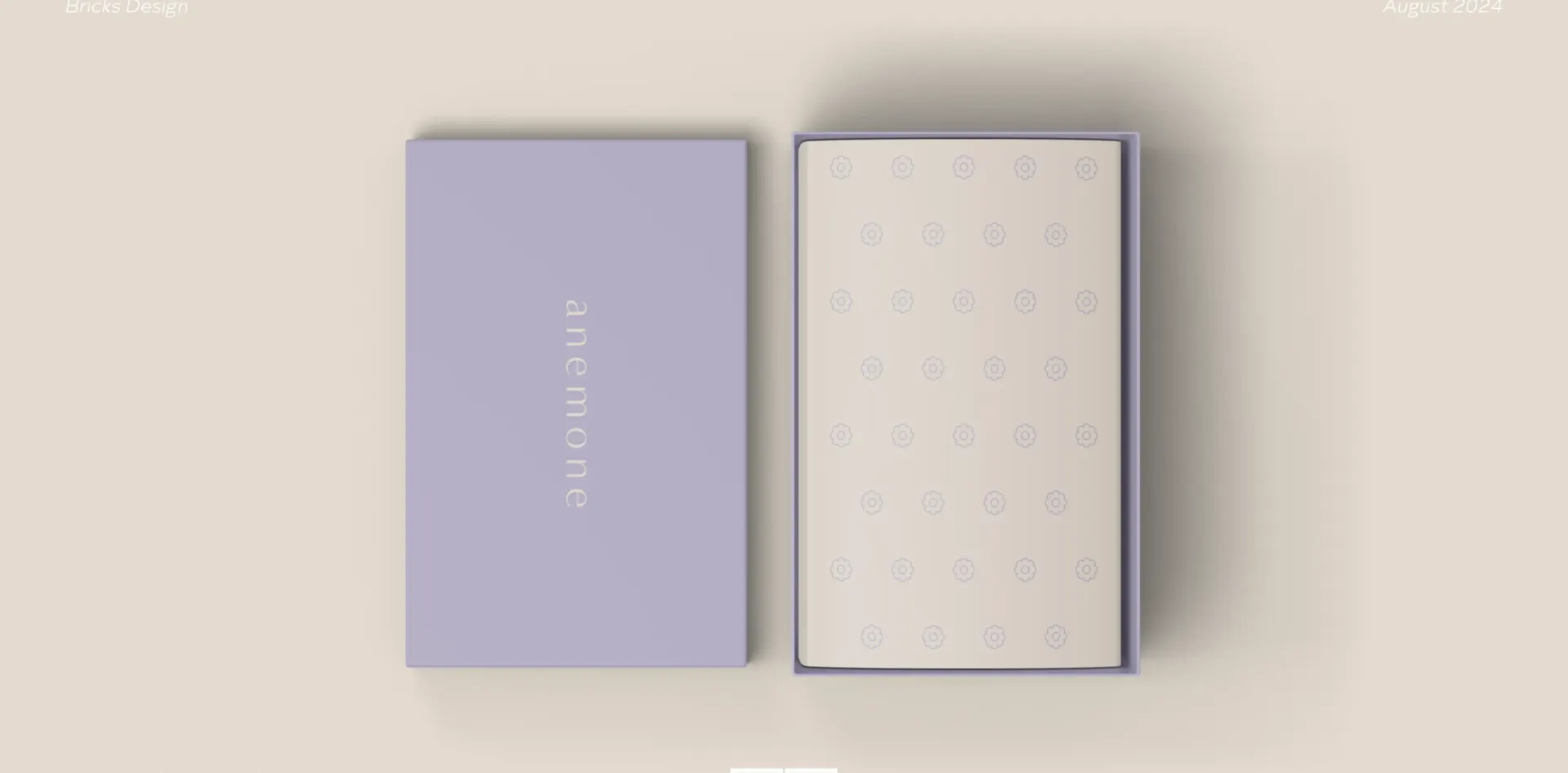
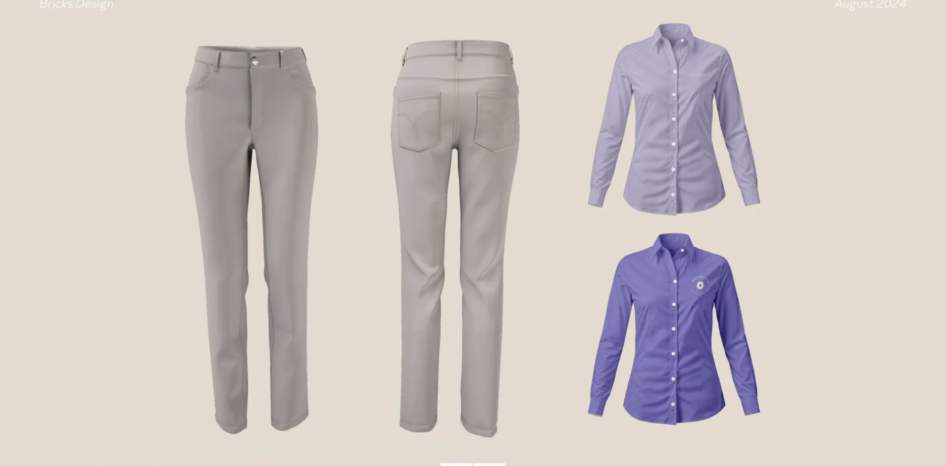
Anemone takes its name into the visual identity through a flower symbol, a delicate wordmark and a lilac and cream palette. Bricks carried the system into packaging, communication layouts and uniforms.
The floral mark works on its own and as a repeated pattern. The same colours and proportions connect the shoe box, tissue and clothing.
- Client
- Anemone
- Sector
- Footwear
- Year
- 2024
- Scope
- Visual identity, Brand guidelines

More branding work
All branding
Work with us
Build your next chapter.
Tell us about the brand and where it needs to go.