Binder
A soft, colourful identity for a baby brand.
Brand identity
About the project
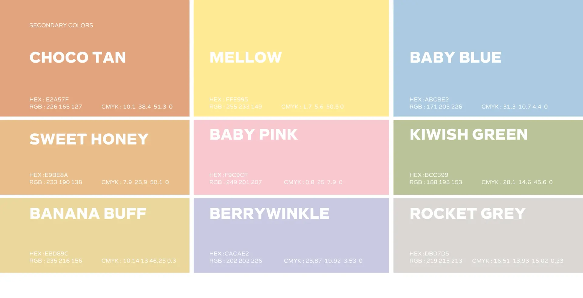
Binder’s visual identity uses a rounded wordmark and a B-shaped symbol. A soft palette and Arabic and English typography give the baby brand a consistent foundation.
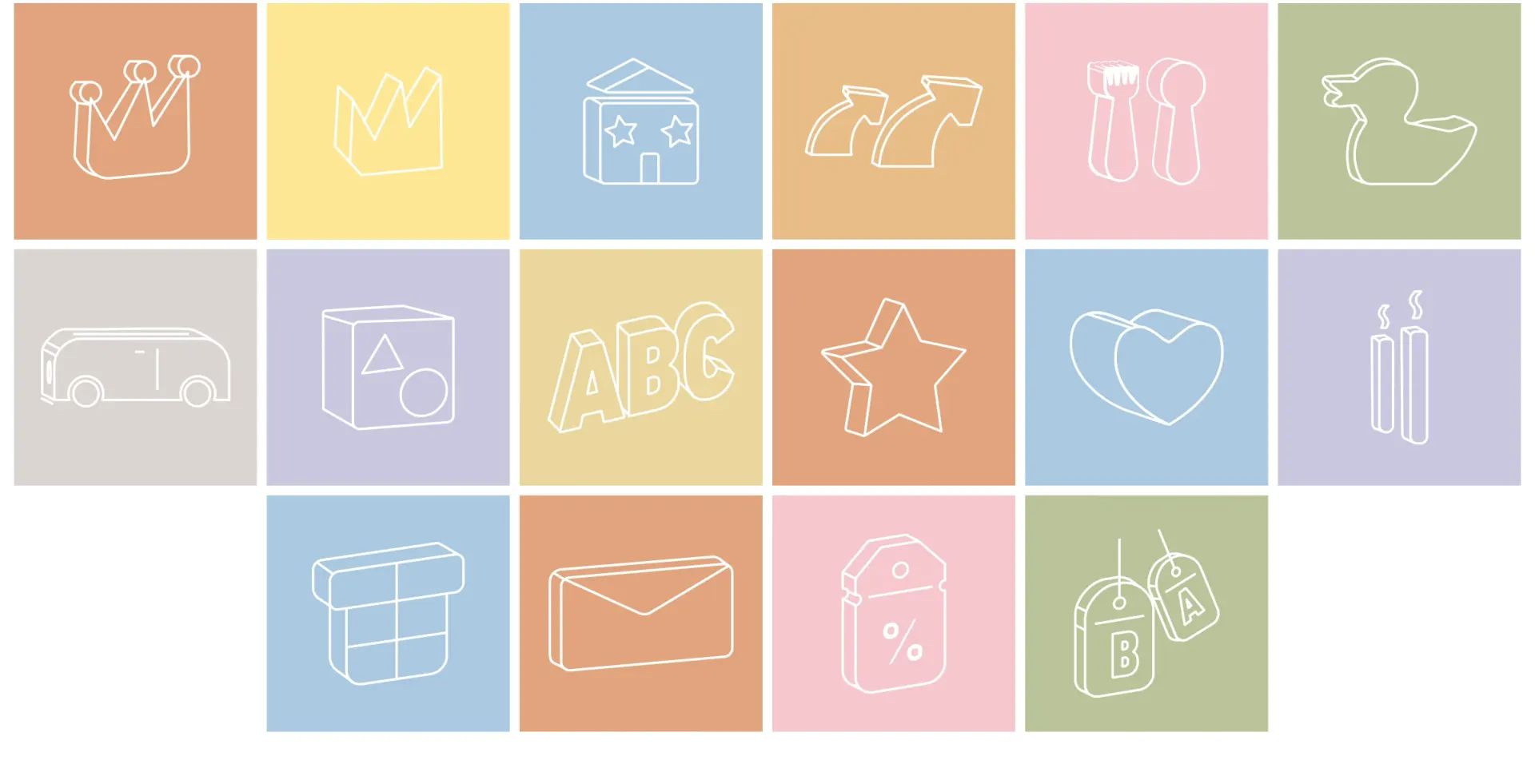
The symbol works beside the name or on its own. A broad palette and a set of simple line icons give the identity room to describe different products.
- Client
- Binder
- Sector
- Baby products
- Year
- 2020
- Scope
- Visual identity, Brand guidelines
More branding work
All branding
Work with us
Build your next chapter.
Tell us about the brand and where it needs to go.