VĂG
Colour and contrast for a fragrance identity.
Brand identity
About the project
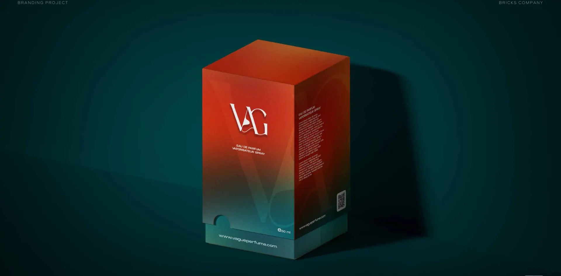
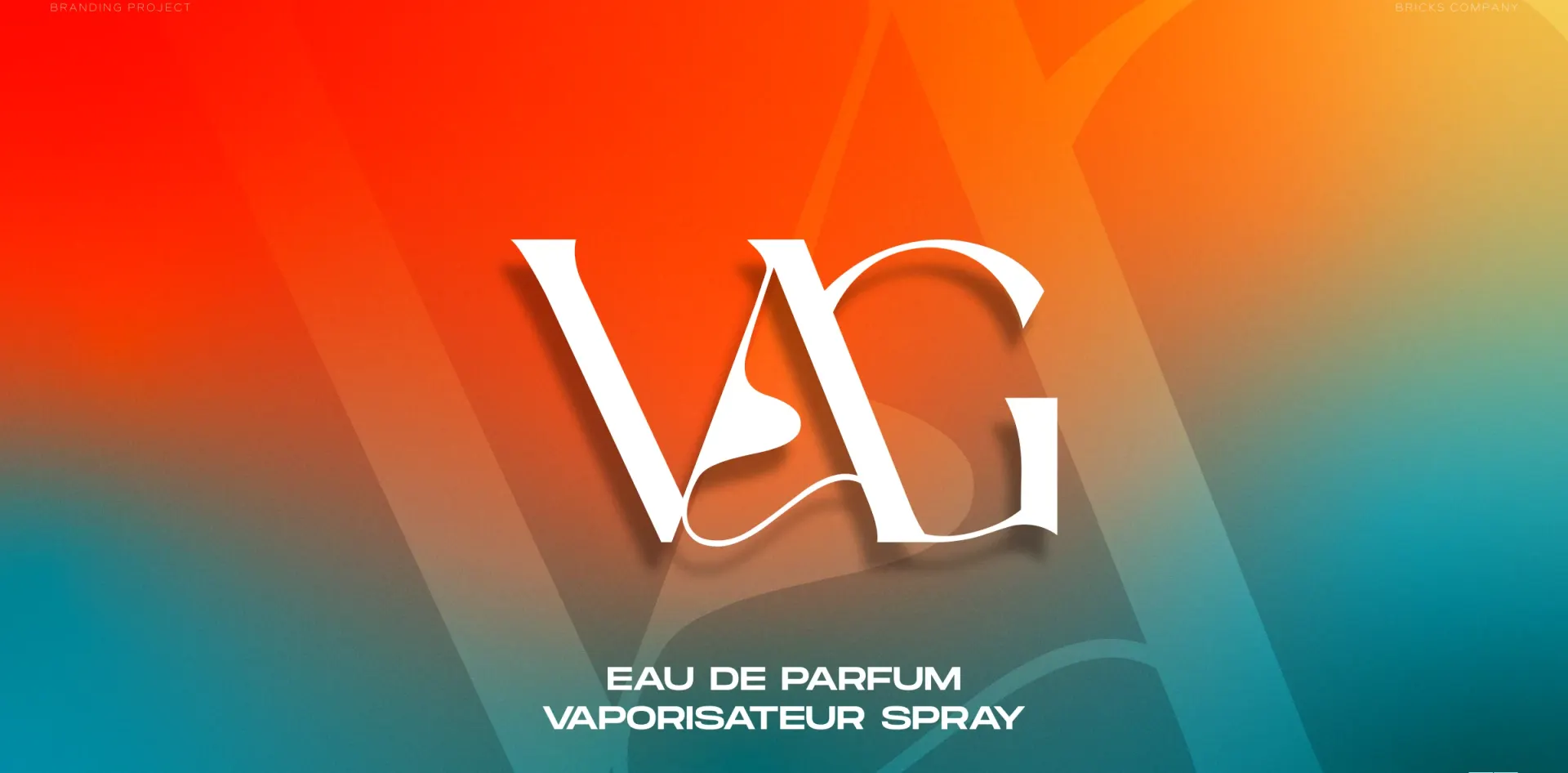
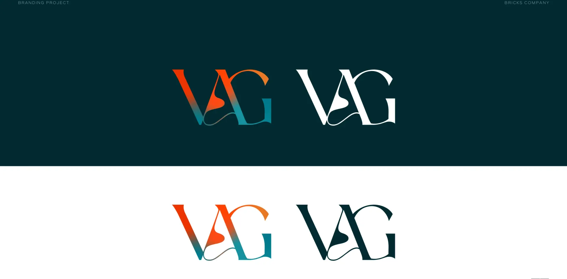
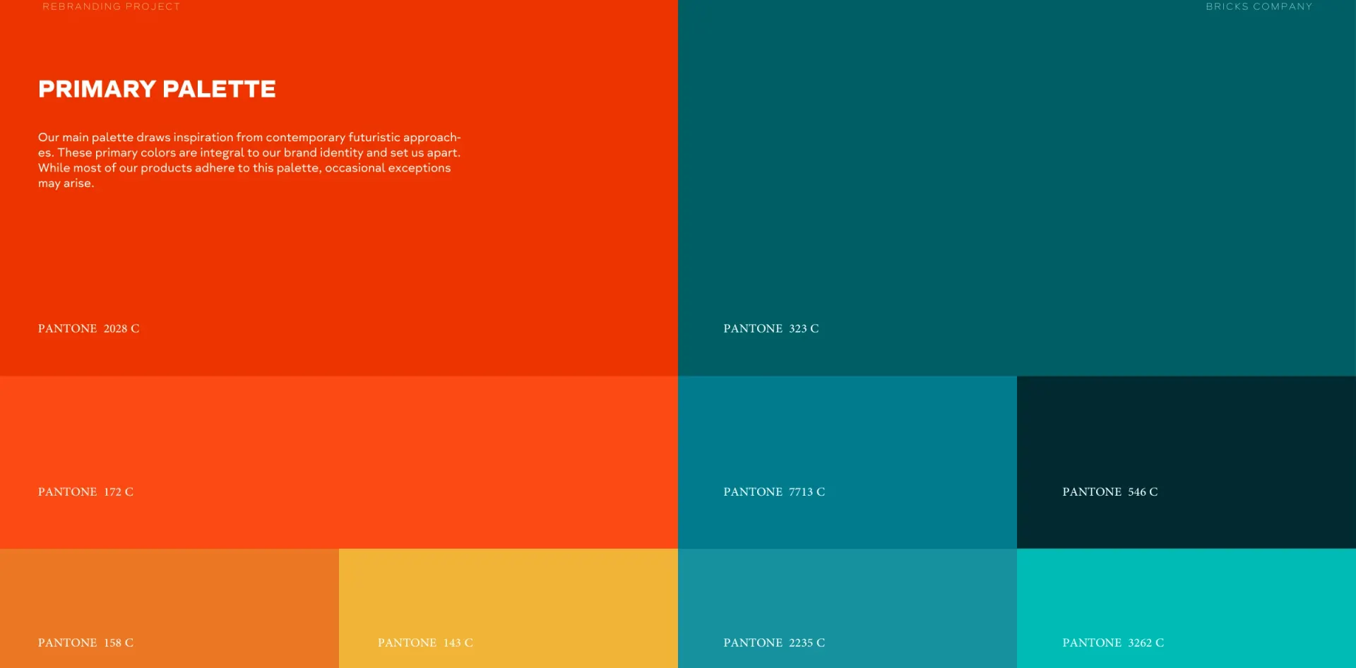
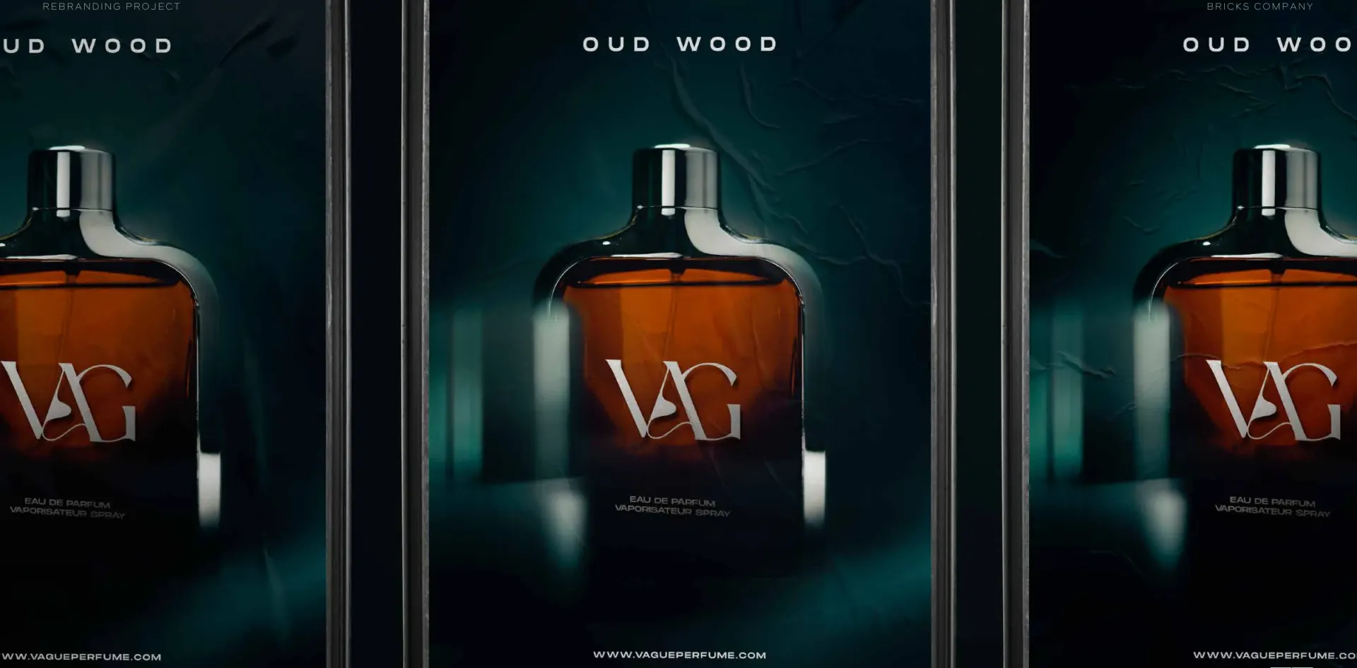
VĂG, Vague Perfume, pairs a sculptural lettermark with a vivid orange and teal gradient. Bricks developed the visual system across the mark, bilingual typography, packaging and communication layouts.
The contrasting colours move from the identity into the perfume box and campaign artwork, while the lettermark provides a consistent focal point.
- Client
- VĂG
- Sector
- Fragrance
- Year
- 2024
- Scope
- Visual identity, Brand guidelines
More branding work
All branding
Work with us
Build your next chapter.
Tell us about the brand and where it needs to go.