DARI
Art direction and a launch campaign for a new way to discover places.
What we did
- Launch strategy
- Art direction
- Campaign
- Photo & video
The project
DARI came to us before launch with a service that had to feel selective from the first frame. The ask was a world that promises access, not another listing app.
The approach
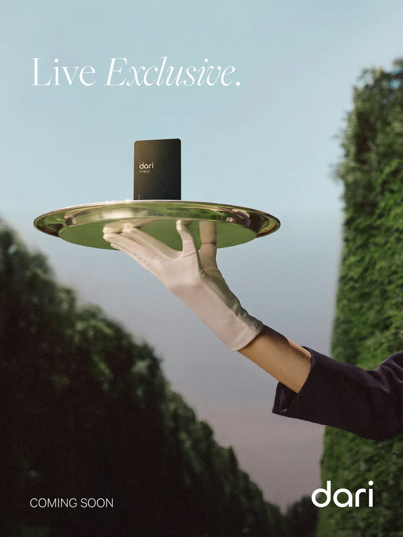
We built the art direction around what stays hidden. Closed doors, gloved hands and single objects carry the story, so every teaser asks a question instead of answering one.
What we made
Launch strategy, Art direction, Campaign, Photo & video.
01
The brief
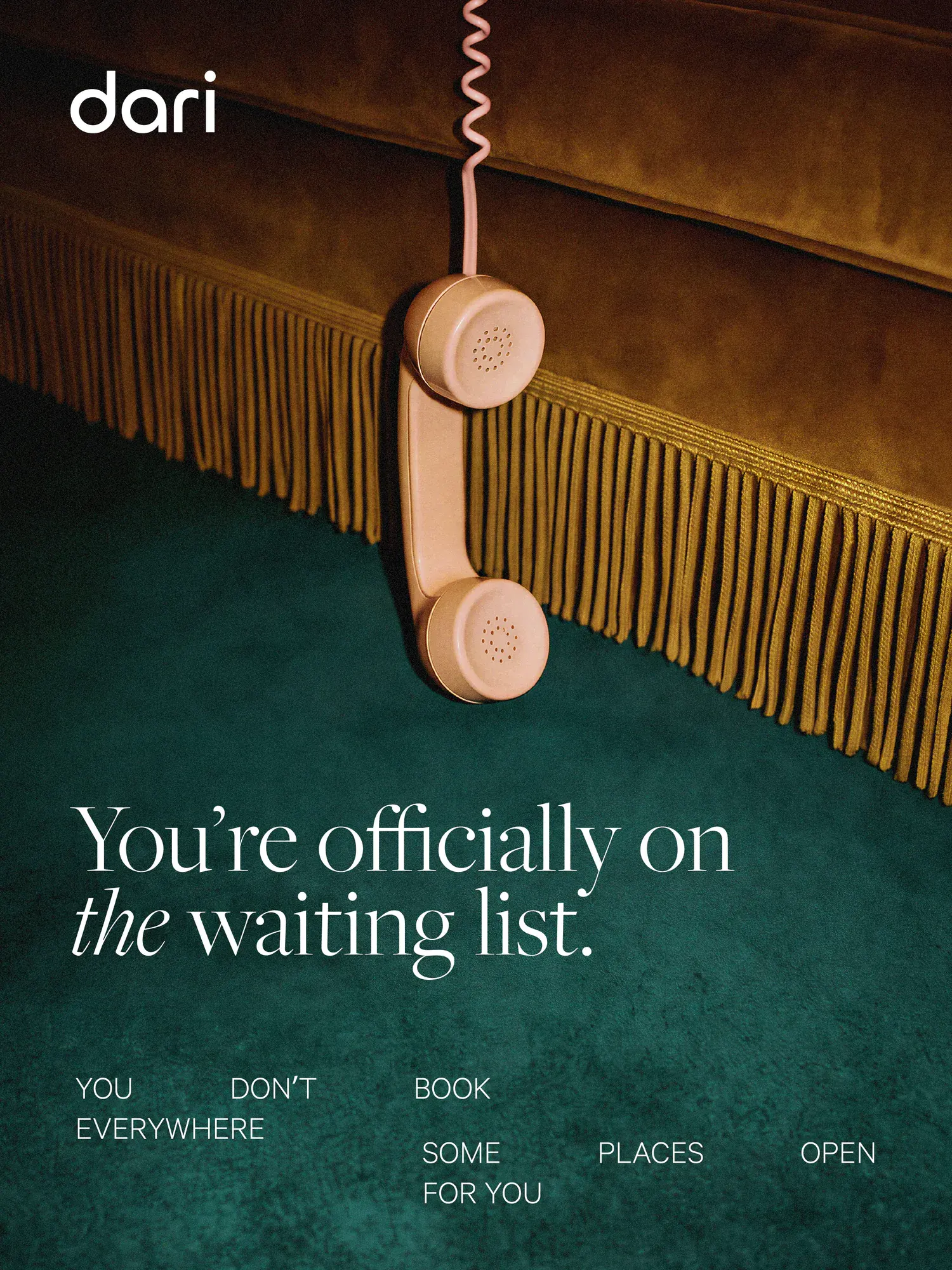
DARI came to us before launch with a service that had to feel selective from the first frame. The ask was a world that promises access, not another listing app. We started by deciding what the campaign would refuse to explain.
02
Say less
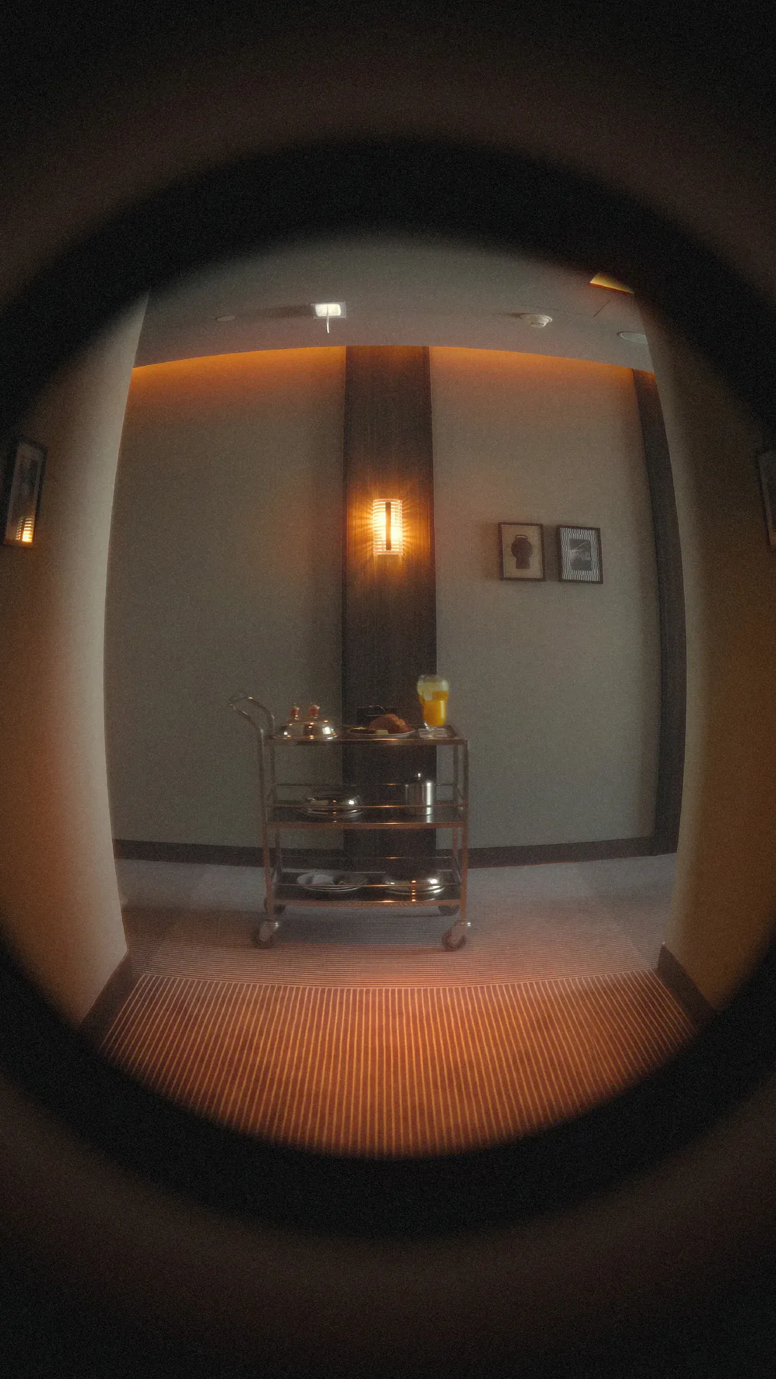
We built the art direction around what stays hidden. Closed doors, gloved hands and single objects carry the story, so every teaser asks a question instead of answering one. The copy stayed short enough to read at a glance inside a story.
03
The places
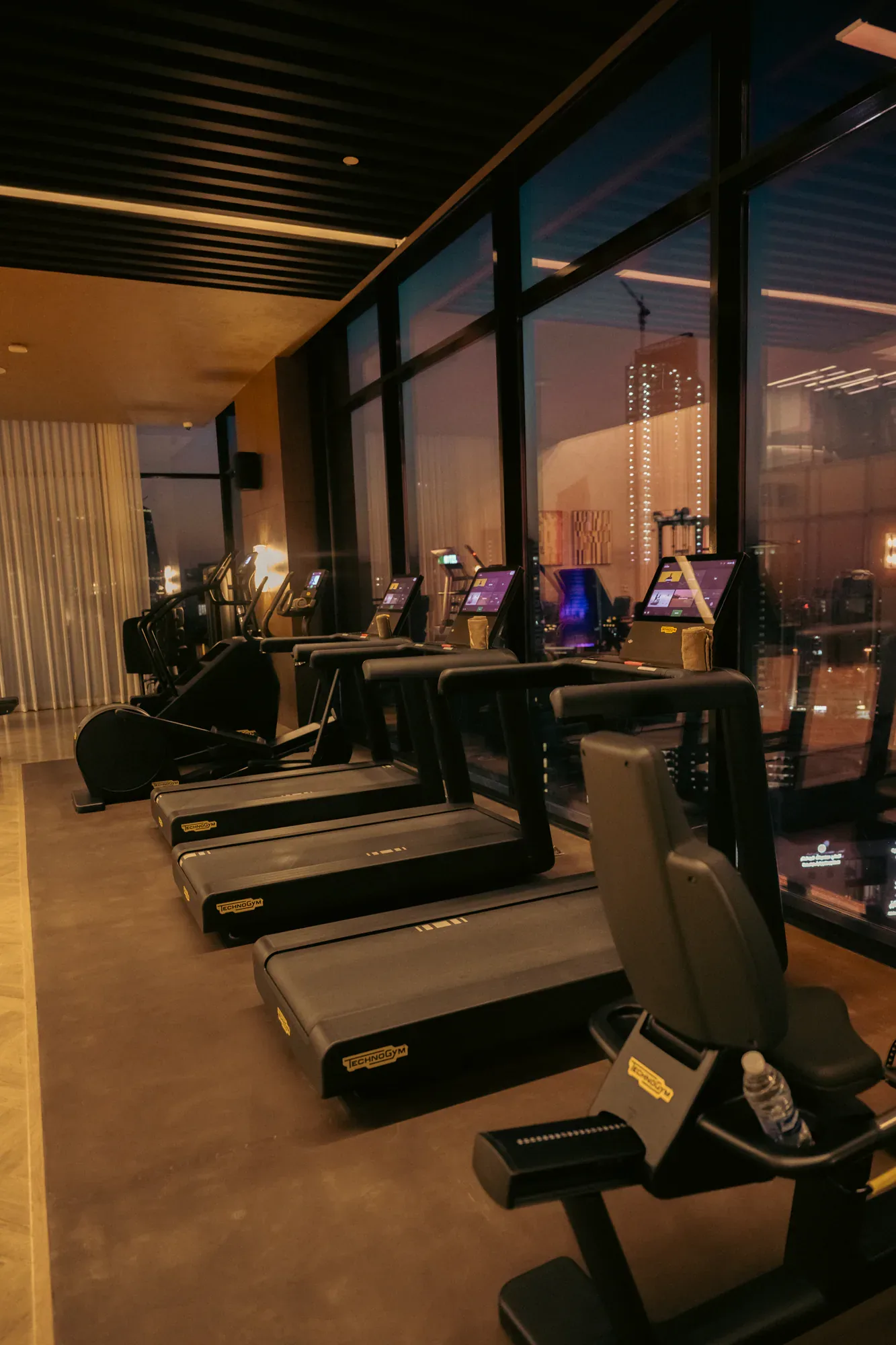
The service is only as good as the rooms it opens, so we shot spaces as places you would want to be let into. Night, warm light and empty floors do more for that than a wide daytime tour. Each location was covered vertical and square in the same visit.
04
The people
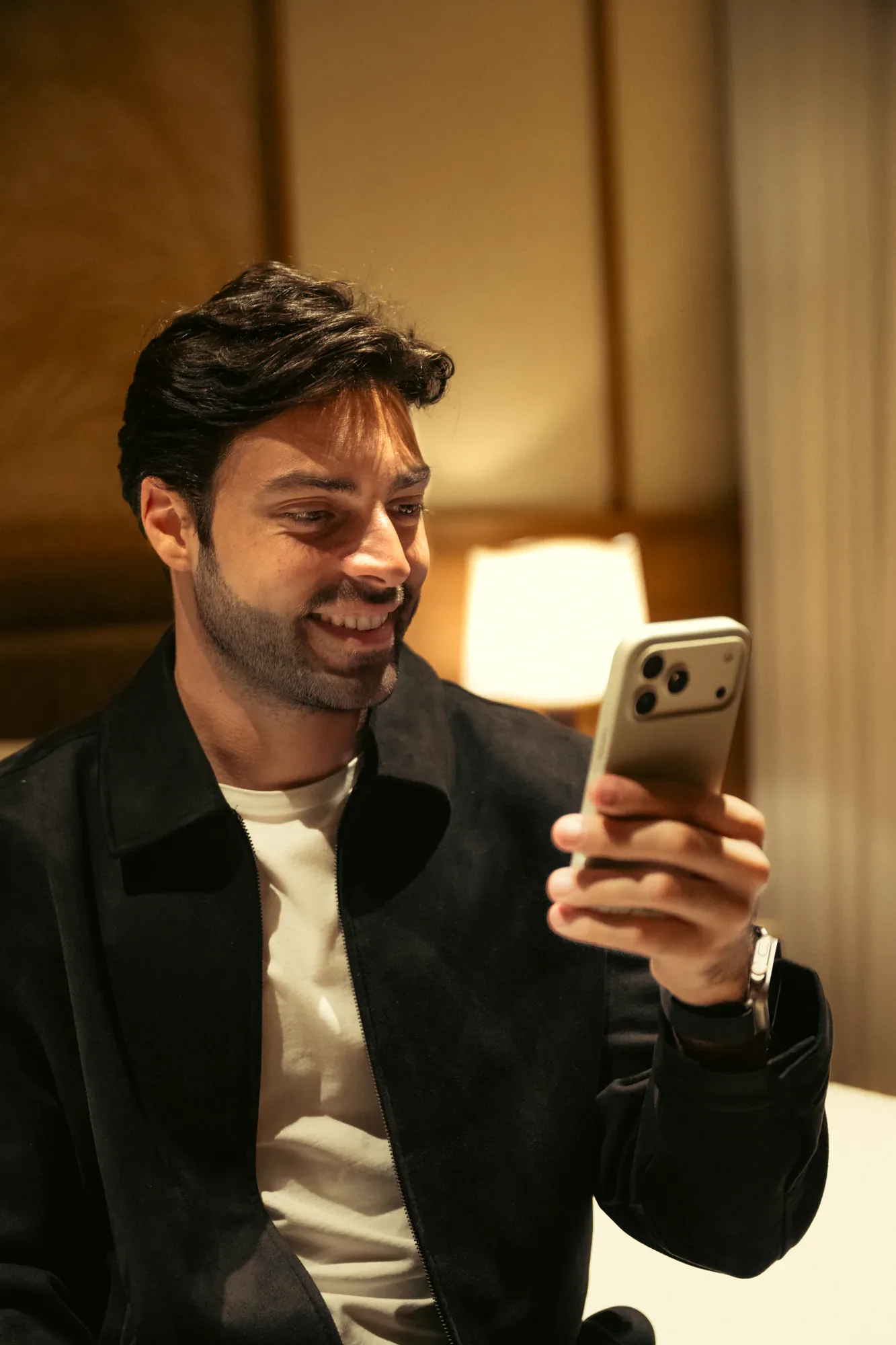
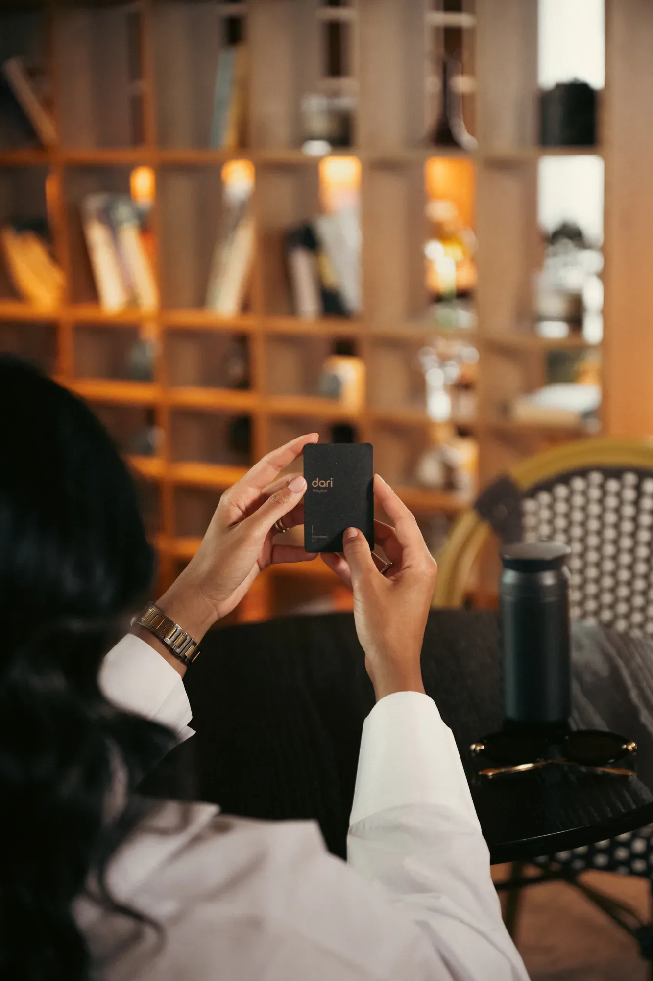
Then we put people back in. The lifestyle frames are deliberately ordinary moments, someone checking a phone or holding a card, because the promise is easier to believe when it looks like a normal evening. It also gave the feed something warm to sit between the teasers.
05
The system
One palette, one type treatment and a fixed set of frames keep the campaign consistent from teaser to reveal to service posts. We handed it over with enough range to run for months without repeating itself. The same language now carries every new announcement.
Next case study
All work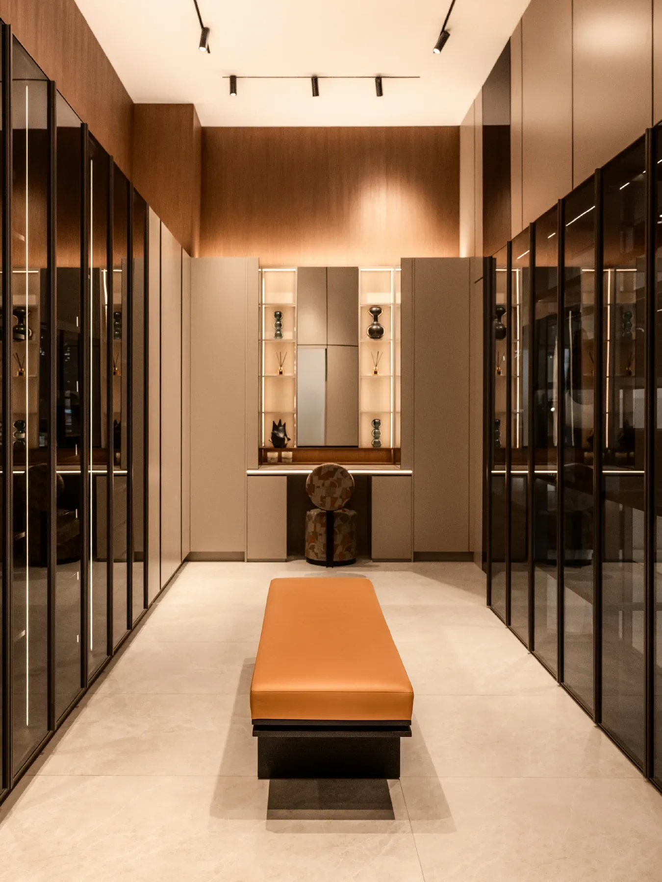
Work with us
Start a project.
Tell us about the brief and who it is for.